Watershed Climate
Redesign Challenge
Redesign Challenge
Abstract
After identifying the need for interfaces to uncertainty to support better reasoning and decision making, I invent two interface primitives for encoding and communicating uncertainty. I then redesign the existing dashboard interface to embed these primitives, while reducing the complexity within the core user flow.
After identifying the need for interfaces to uncertainty to support better reasoning and decision making, I invent two interface primitives for encoding and communicating uncertainty. I then redesign the existing dashboard interface to embed these primitives, while reducing the complexity within the core user flow.
Metadata
2400 words.
2 weeks.
2400 words.
2 weeks.
Introduction
Watershed Climate provides data dashboards to enterprises seeking to measure, report and reduce their carbon footprint. These dashboards are inference engines; they support reasoning and decision making around the data that they present, playing a crucial role in shaping climate policies.
Watershed counts Fortune 500 companies amongst its clientele, many of whom are the world’s largest polluters. When their decision makers quote dashboard data to orient and plan climate policy decisions for the company, they are also making climate decisions for us all.
Watershed’s dashboards are consequential, and they must be designed responsibly.
Problem Decomposition
Proceeding from my motivational frame above, I then sought to understand and critique the existing product to identify a potential problem to solve.
Interface Critique
First, I critique the existing dashboard with an aim to understand key user flows and the user goals they attempt to meet. In playing the role of user, I introspect and observe, identifying pain points and shortcomings of the application.
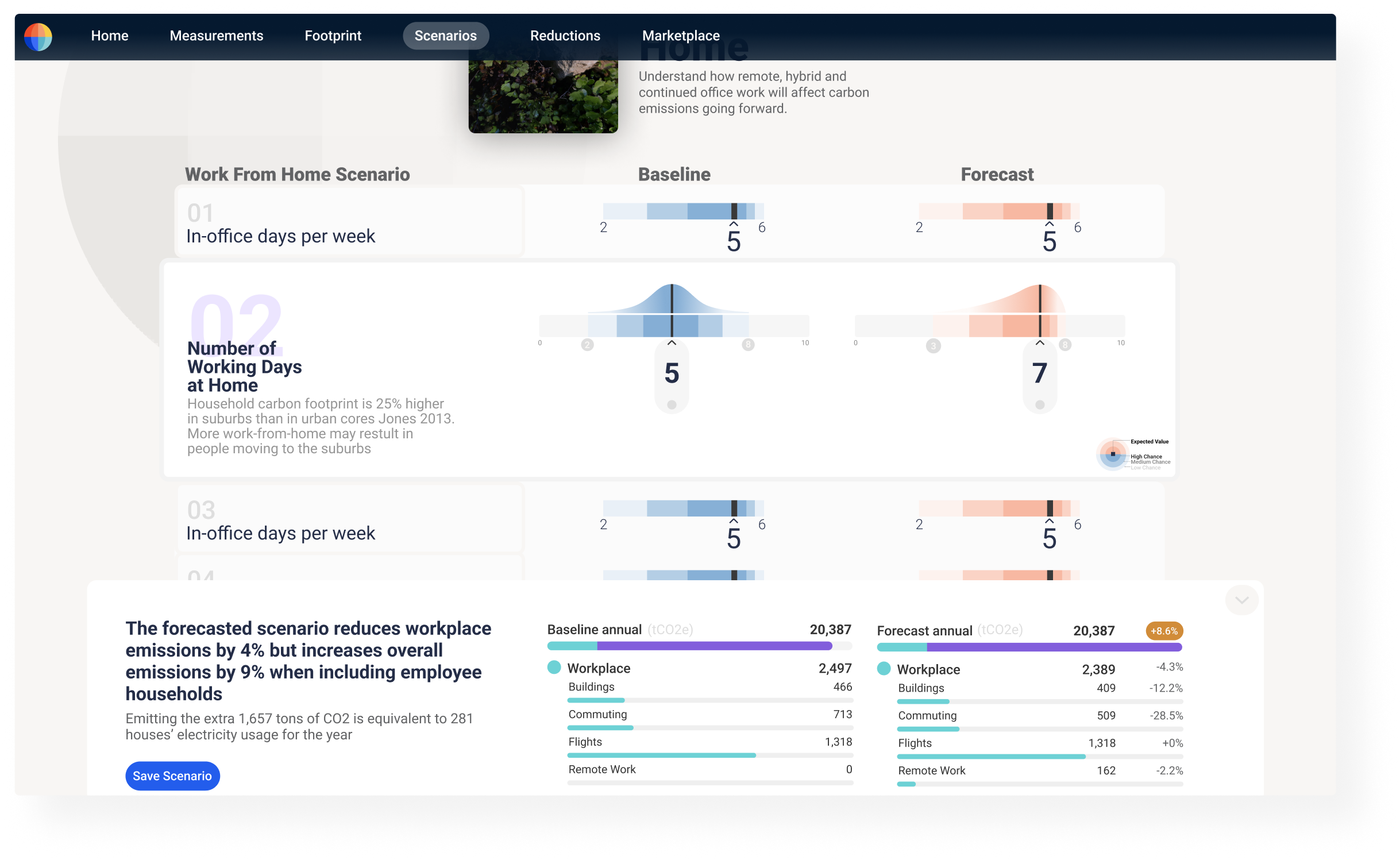
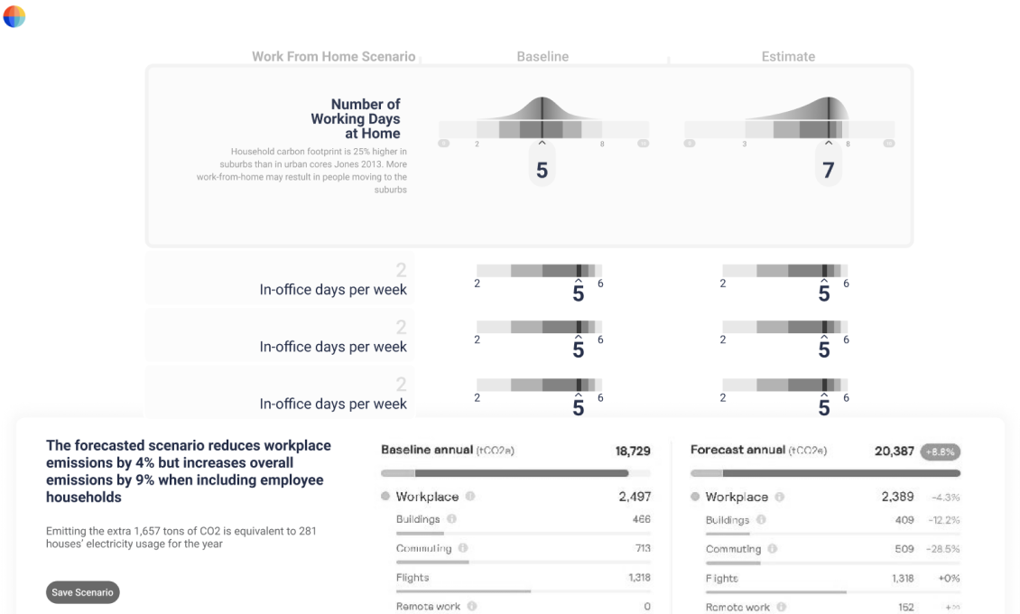
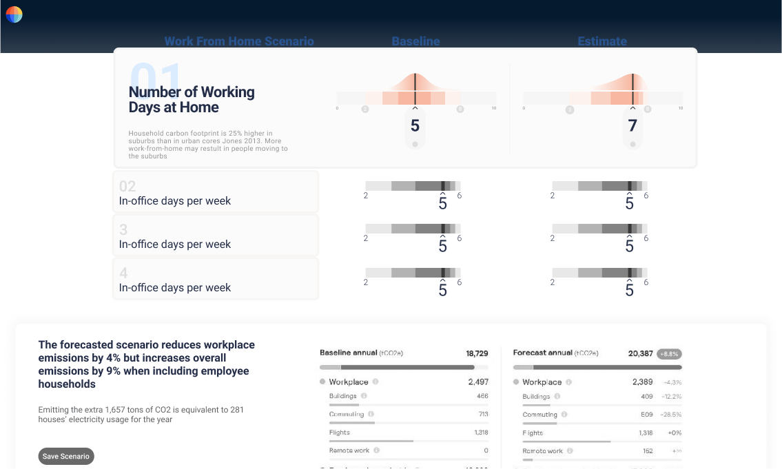
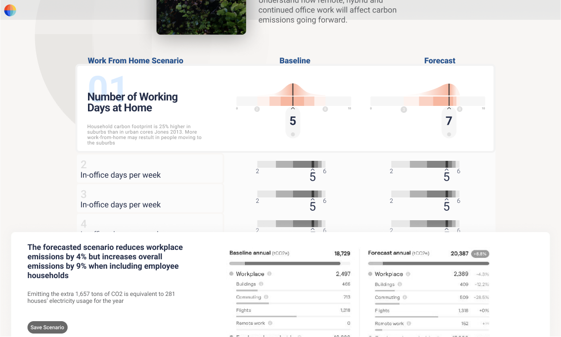
This is a dashboard in the Watershed product used to estimate how transitioning to work-from-home will affect company emissions.
![Fig 1. Interface Keyframe of the Watershed product.]()

The user is guided through a series of Input Modules from the top of the screen to the bottom, where Baseline and Forecast values are estimated. For example, a Baseline of 5 days/week and Forecast of 2 days/week for the “In-Office days per week” input module reflects transitioning to a more hybrid or remote working culture.
While I observed some lower-level UX improvements (which I define and solve in a later section), I was struck by a conceptual deficiency at the interface level; the “+8.6%” increase to 20,387 tons of CO2 emissions is a mean prediction (or, more formally, a point estimate), but has no measure of uncertainty.
To illustrate the need for uncertainty, consider this forecast of atmospheric CO2 concentration. Using atmospheric CO2 data collected from the Mauna Loa observatory in Hawaii from 1995 to 2020, a Bayesian prediction model I created is able to make the disquieting prediction of a rising year-over-year CO2 trend.
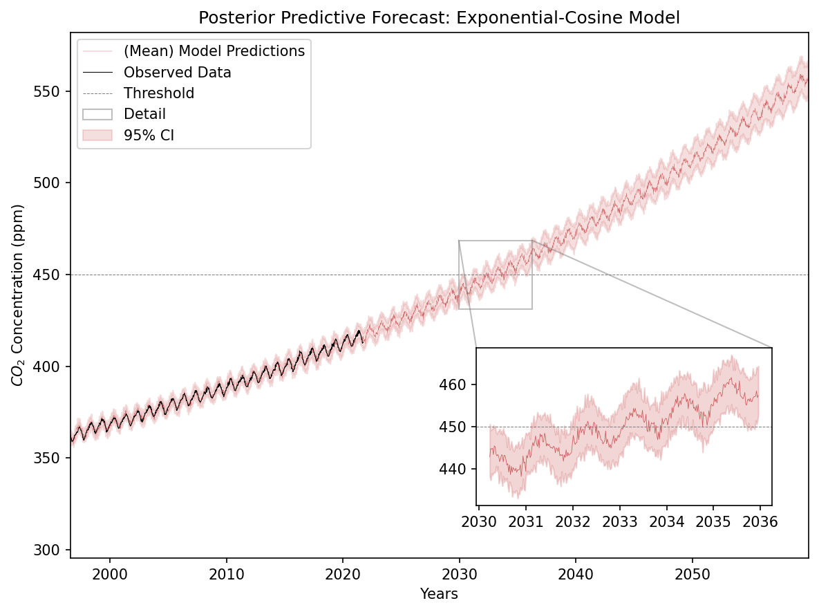
Like Watershed’s models, it provides a mean prediction (dark red line). But unlike Watershed’s models, it also provides an uncertainty window ( light red area; 95% Confidence Interval).
Climate scientists warn that if we cross 450 ppm threshold we will face irreversible climate changes [citation]. According to the mean prediction, this occurs in early 2032. However, when considering the uncertainty interval, we have an upper bound estimate for crossing this threshold in mid-2034, and a lower bound estimate of early 2031 - a full three year range!
An uncertainty window of three years is long enough to have drastic implications on climate policy and planning. And yet, the Watershed Climate dashboard has no interface to these uncertainty windows. This is the core problem I aim to solve in this redesign.
Problem Definition
As a Bayesian, I strongly believe that when you want to make sound decisions based on forecasts, it is not only important to quote, question and plan around what to expect (ie the mean prediction provided by the current dashboard) but what to be surprised by (i.e what falls outside the 95% Confidence Interval). That decision making is enhanced by capturing, modelling and visualizing uncertain data is also well supported in the literature [1][2].
As a result, the central problem my redesign will attempt to solve is how to open up interfaces to uncertainty to make better predictions, and in turn better decisions.
Design Principles
Design Principles place guiding constraints on exploring the solution space; they begin to define the shape of the correct solution.
Principle I . Uncertainty In, Uncertainty Out
According to Hullman et al (2018), there are 8 sources of uncertainty in a modelling process.
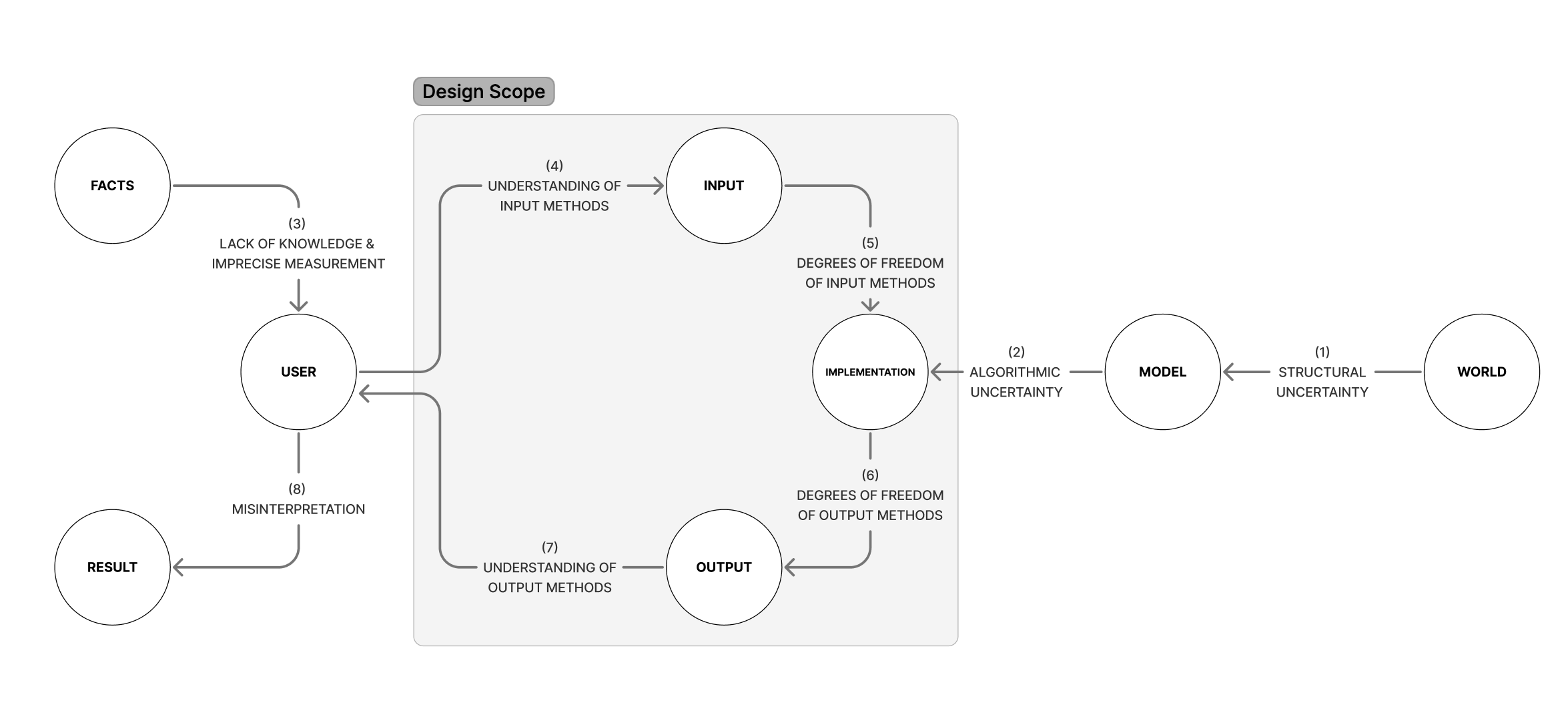
In order to constrain the scope of this redesign, I will focus on areas that UI/UX design could have the most impact - points (7), (6), (5) and (4). I bundle this approach with the principle “Uncertainty In, Uncertainty Out”:
-
[Acquiring Uncertain Inputs from the User] Uncertainty In: an input control that encodes well-calibrated uncertainty. In Bayesian terms, an uncertain input is called a prior and represents the user’s beliefs.
Every Bayesian model is an elaboration on a simple formula: prior + evidence = posterior. By creating an interface for encoding priors with Uncertainty In, we open up the possibility for Watershed to utilise this powerful class of models that can handle uncertainty.
- [Presenting Uncertain Outputs from the User] Uncertainty Out: a component that aids in the interpretation of a distribution over an output.
Uncertainty Out ensures that the reasoning around uncertain outputs is sound. While confidence intervals seen in Figure 2 above are one such presentation, there is more work needed in presenting distributions.
Principle II . Speak in Plain Terms
To centre these high-level ideas on the user, I researched the following user persona based on user testimonials on Watershed’s website.
Cindy is a motivated and experienced decision maker in a Fortune 500 company with a Bachelor's degree in Business Administration.
She is passionate about the environment and is constantly looking for ways to reduce the company's carbon emissions, mitigate potential risks and find innovative solutions.
Decision makers like Cindy are unlikely to have the statistical literacy to encode priors in precise mathematical language. We cannot expect her to say, "I anticipate a log-normal distribution over the number of days we work from home, centred at 2, with moderate deviation, say a standard deviation of 0.5".
However, you can expect them to reason with everyday language about uncertainty "I expect us to work 2/5 days from home, as high as 3ish, but no lower than 1 day a week". As such, we need to explore how to encode intuitive probabilistic statements in a precise, perceptual and unbiased way. There is a need to interface uncertainty using plain terms.
Design Question
Combining the design principles led me to the overarching design question, How might we create a visual lexicon of uncertainty that values intuitive notions about probability?
A visual lexicon is a set of components or UI primitives that allow a statistically-naive decision maker to encode or interpret uncertainties in an intuitive but well-calibrated way.
Design Solutions
I.
Distribution Slider
[component]
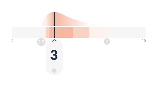
This design solution introduces an "Uncertainty Slider" component that allows for intuitive estimation of uncertain inputs through the a Range Slider and corresponding Estimated Distribution.
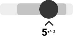
Range Slider
The Range Slider has three points of input: a left extent, a right extent, and the mean value. The mean value is surrounded by a 3-tone descending gradient to the left and right, estimating changes in probability density through interpretable steps in color gradient.
As the user shifts the mean up and down, the entire range shifts up and down. If the user draws out the right or left extent, they lengthen out the extents of the distribution. Thinking through three settings - best estimate, upper bound and lower bound - the user can encode the mean, skew and kurtosis of the distribution.
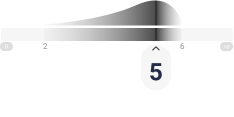
Distribution Feedback
To provide feedback on the range slider interaction, a distribution is estimated above the Range Slider that reacts in real-time to input changes. Through this interaction feedback of “change the Range Slider → Change the Distribution”, the user may develop a mental model for continuous probability distributions through repeated experimentation with the sliders.


II.
Quantile Dotplot [Component]
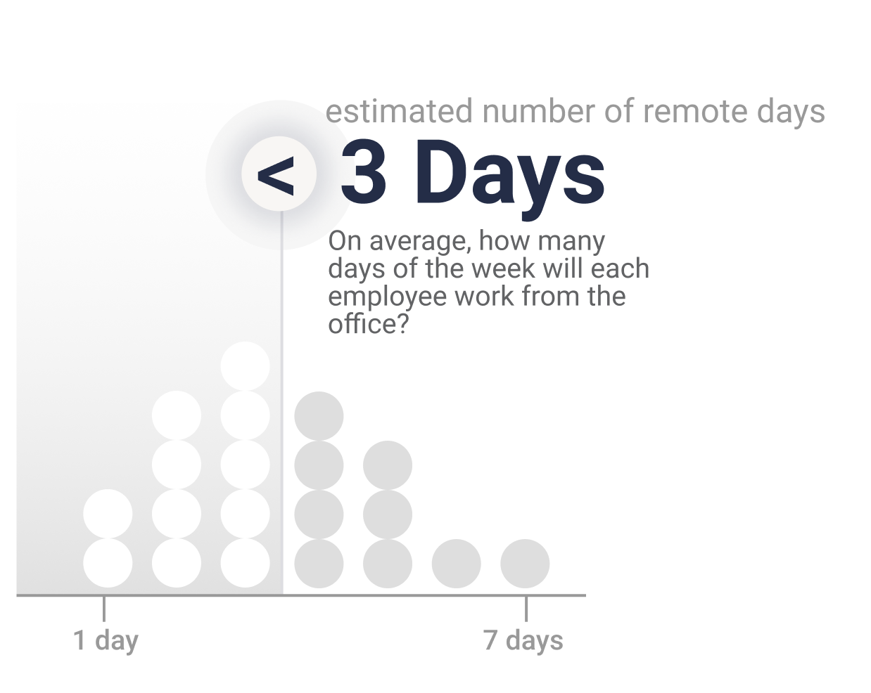
To present distributions over output results, I developed “quantile dotplots”, working off of Kay et al. (2016).
In place of presenting continuous probability distributions (where questions of probability reduce to estimating weirdly shaped areas as a function of smaller weird shapes), we discretise the distribution to twenty dots so that questions of probability can reduce to questions of counting.
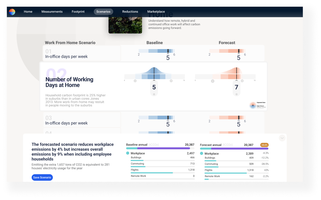
Solution: To clean up the interface, I break up the scenario into a series of unique “Module” components with a three-column structure: a prompting question, with a Baseline input and Forecast input. These discrete components toggle when inactive, creating a compact and descriptive overview over scenario inputs at a glance. To acquire a sense of familiarity, I inherit the same colour palette and overall aesthetic of the existing dashboard.
Increased negative space, a wider palette and visual cues (a grayscale Watershed logo, strong axis lines) guide the eye towards focusing on one input at a time. I also create a consistent framing between the baseline and forecast inputs by casting them to a tabular layout, allows for an easier scan.
The new layout selectively draws attention, and the hypothesis is that users will feel more comfortable experimenting with input configurations more.
During design iterations for the Interface Redesign. I prioritise negative space, an expanded colour palette, collapsibility and a grid system to allow for selective attention: the user can focus on one module at a time. With a more compact layout, we can make use of the increased area to emphasise active input controls.

Next Steps

This proposal has explored ways in which Watershed can create a more flexible class of predictive models by focusing on the acquisition and presentation of uncertainty to users with scarce statistical knowledge. If given time, I would also like to explore:
- The design principle of “Appropriate Timing”
- Since the dashboard is a tightly designed inference system, there is scope for using animation to communicate results. Hullman et al. (2019) have flagged Hypothetical Outcome Plots as an intuitive way of displaying distributions over outputs.
- User feedback
- What are the specific decision tasks that benefit from better visualisation?
- How are people making judgments and decisions from a visualisation?
- How do visualisations support causal inference? If so, how can we reduce bias in Effect Size judgments ?
References
- In Pursuit of Error: A Survey of Uncertainty Visualization Evaluation
- StanCon 2020. Talk 10: Matthew Kay. Building effective uncertainty visualizations
- The Functional Art: An Introduction to Information Graphics and Visualization
- Matthew Kay: Uncertainty visualization and Bayes
- Theories of inference for visual analysis
- Visualizations of Distributions and Uncertainty